

Therapy Brand Photography That Aligns: A Case Study in Therapy Practice Rebrand with Definition Counseling
When Arlyn, the founder of Definition Therapy and Counseling, came to me, she had already laid the foundation for a powerful rebrand for her practice, in collaboration with Studio Crescent Co. Jess from Studio Crescent had crafted a beautiful new logo, a soothing color palette, and a website that reflected the heart of Arlyn’s practice: calm, welcoming, and grounded in connection. My job? To bring that brand to life through images.
A Fully Aligned Collaboration
Working closely with Jess made this shoot especially rewarding. Because the visual brand direction had already been so thoughtfully developed, I was able to tailor the photo session to fit seamlessly with the website and marketing strategy. This kind of alignment makes a huge difference—it ensures that every image supports the story a brand is telling, rather than just filling space.
The Vision
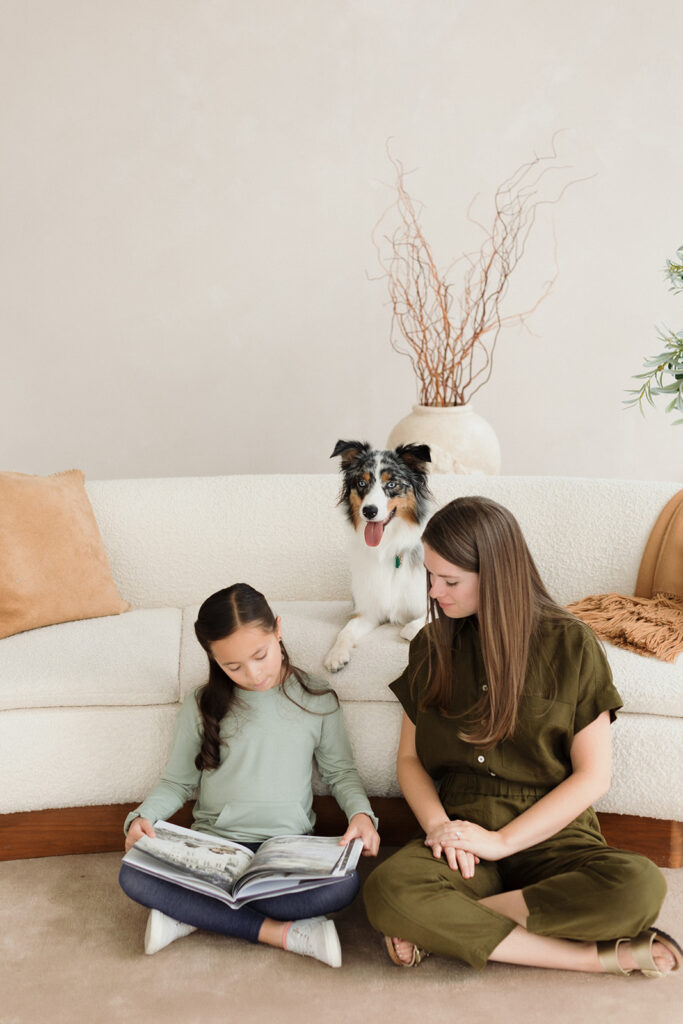
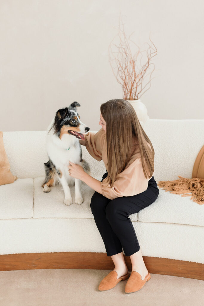
Arlyn’s goals were clear: she needed photography for her website that felt neutral, warm, and approachable—images that would help potential clients feel at ease, whether they were seeking support for themselves, their relationships, or their families. Since the Definition Therapy practice offers both in-office and virtual sessions, we also wanted to show that flexibility while staying rooted in the comfort and professionalism of their physical space.

The Challenge: Representing Care Without Cliché
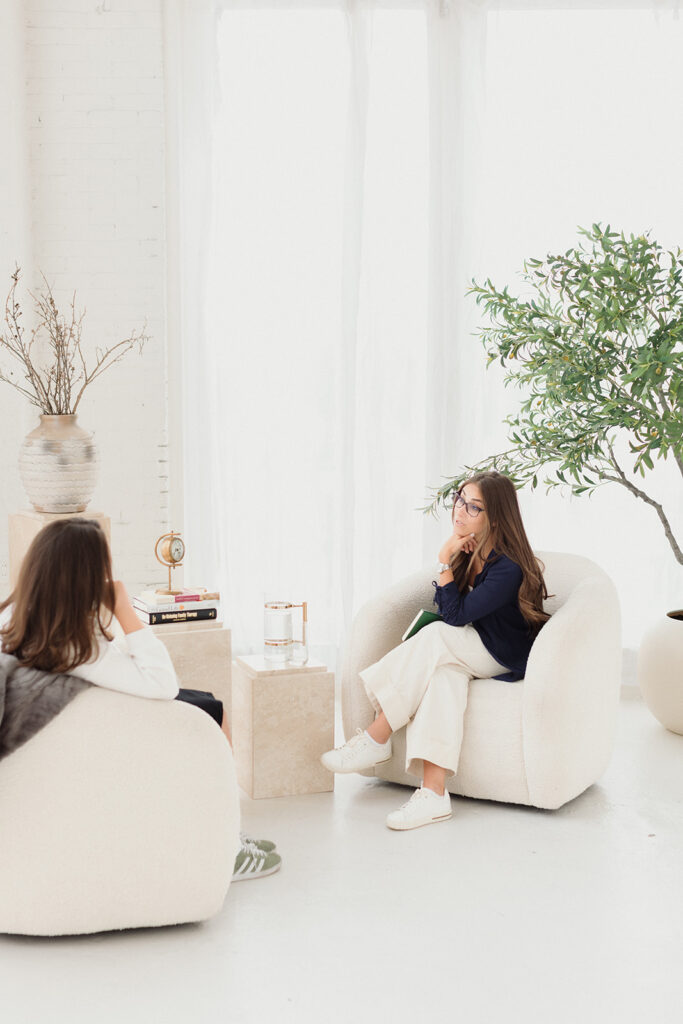
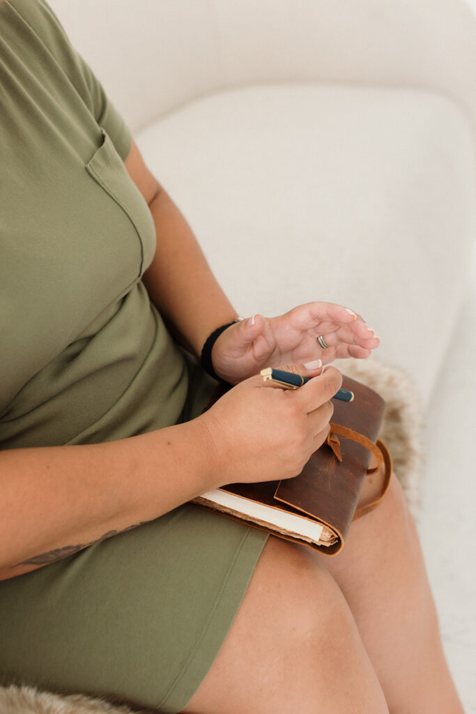
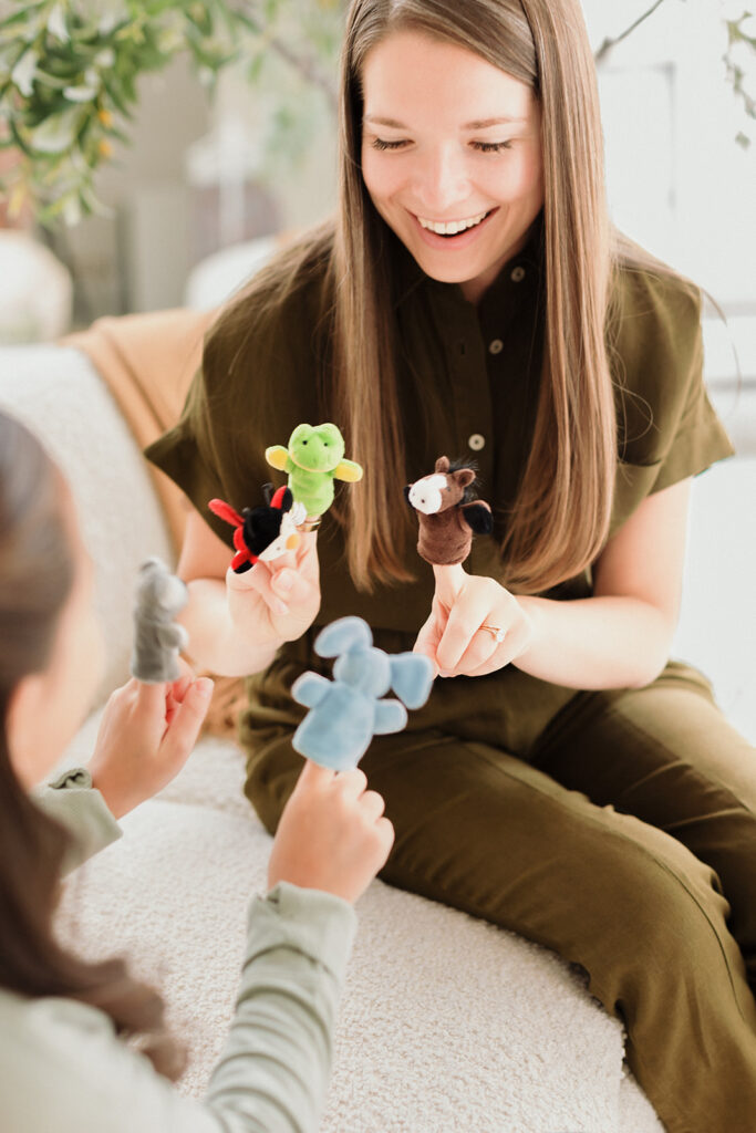
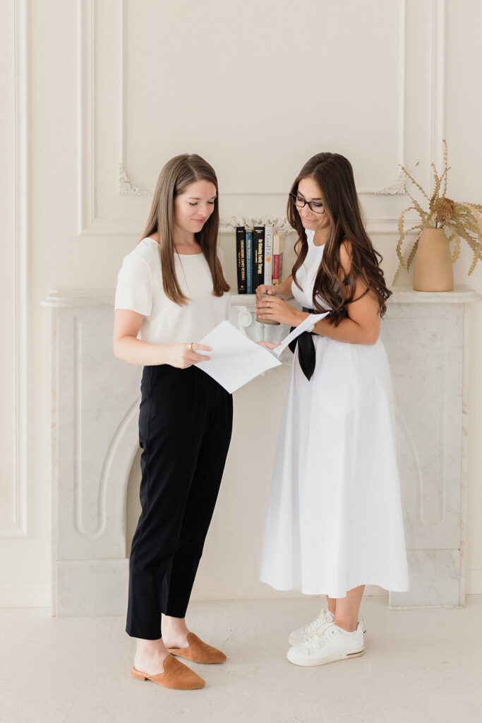
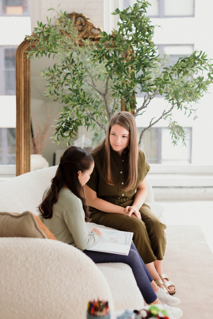
One of the trickiest parts of this shoot was working with a mix of real staff and model clients. We needed to visually represent what therapy looks and feels like at Definition without compromising anyone’s privacy or veering into stock-photo territory. The solution? Focus the lens on the practitioners themselves—capturing subtle gestures, authentic moments, and the environment where the work happens. This allowed us to show the human side of therapy while maintaining professionalism and trust.


The Outcome
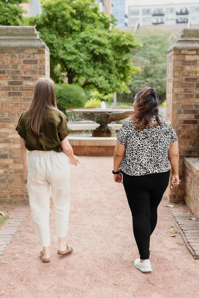
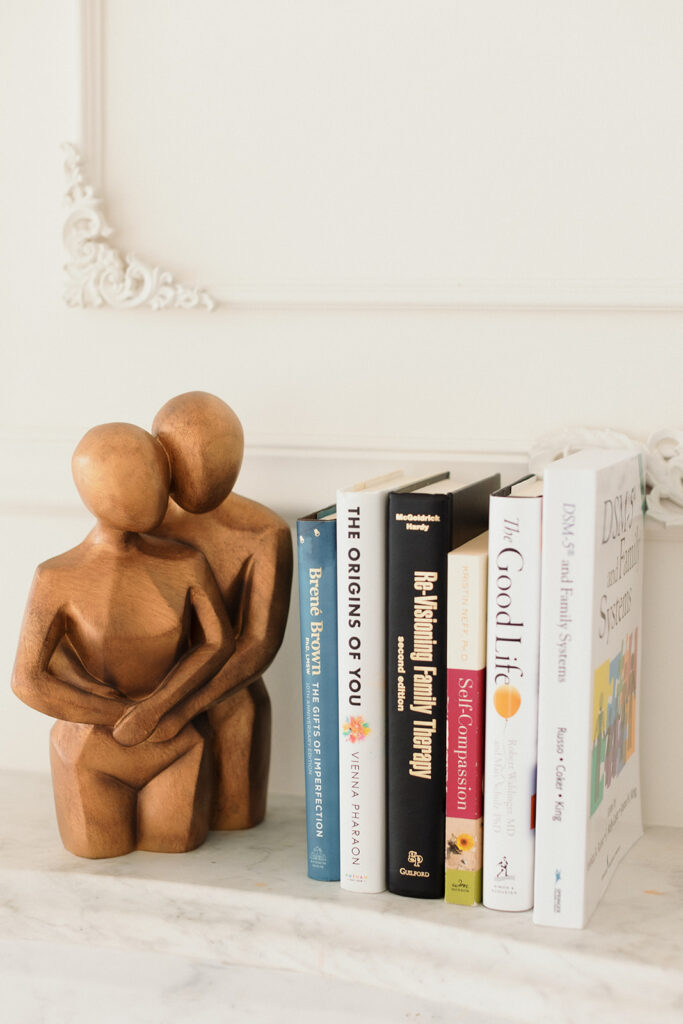
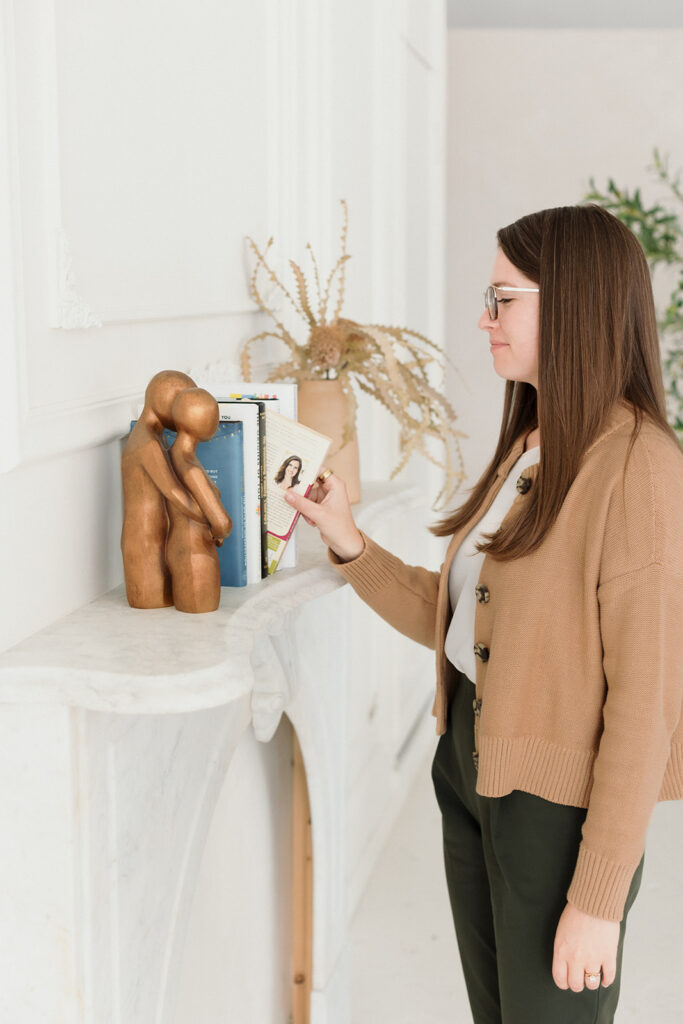
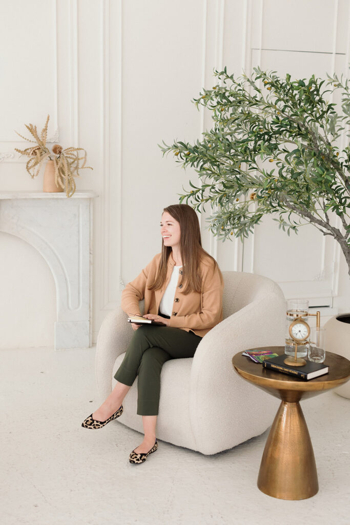
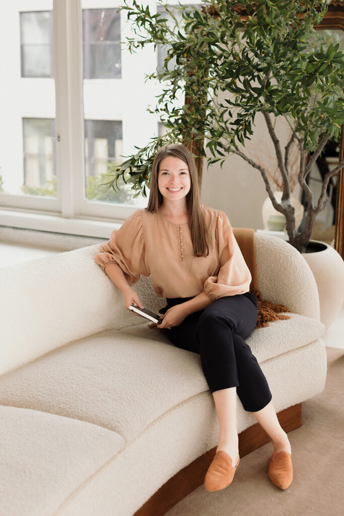
The final gallery included a mix of environmental portraits, candid team interactions, quiet moments in session, and lifestyle details that reflect the welcoming nature of the space. Arlyn’s new website feels like an open door: calm, inviting, and personal. Since the launch, the Definition Therapy practice has also started using the photos on their Instagram as they expand their online presence and grow their practice.


“Thank YOU! These are awesome! I really appreciate the time, creativity, and energy you’ve put into everything. I look forward to continuing to work with you as our practice grows!”
The Takeaway
That kind of feedback is why I do what I do. These images aren’t just photos—they’re tools that help people show up more fully, connect more deeply, and build brands that feel aligned from the inside out.
This shoot is a perfect example of why visual brand strategy matters. Because Arlyn had already invested in thoughtful design work with Studio Crescent, we were able to skip the guesswork and focus on execution. Every decision—from lighting to location to wardrobe—was rooted in clarity and intention.
And that’s what brand photography should be: not just pretty pictures, but tools that support your mission and connect you to the people you’re here to serve.
Are you a therapist or wellness pro whose brand photos say “stock image” instead of “safe space”?
Let’s fix that. I create warm, grounded imagery that helps your future clients feel seen, supported, and like they already trust you—before they even book a session. If your rebrand is begging for photos that actually match your vibe, let’s chat.


")
")